Watch the video to get a glimpse of the newly refined interface of Viedoc Me, and keep reading to find out more.

Rolling out our UI-optimization project, for greater discoveries

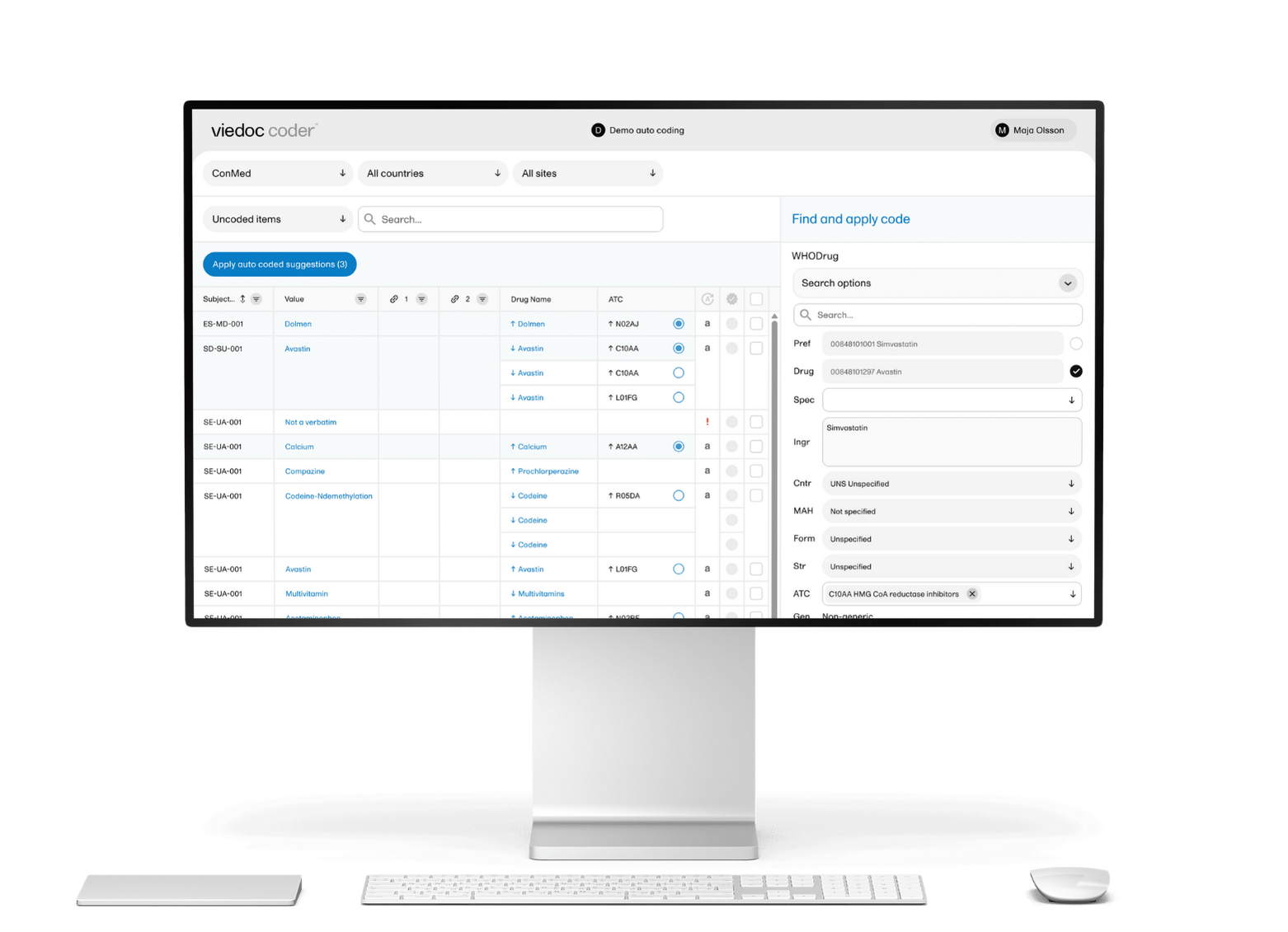
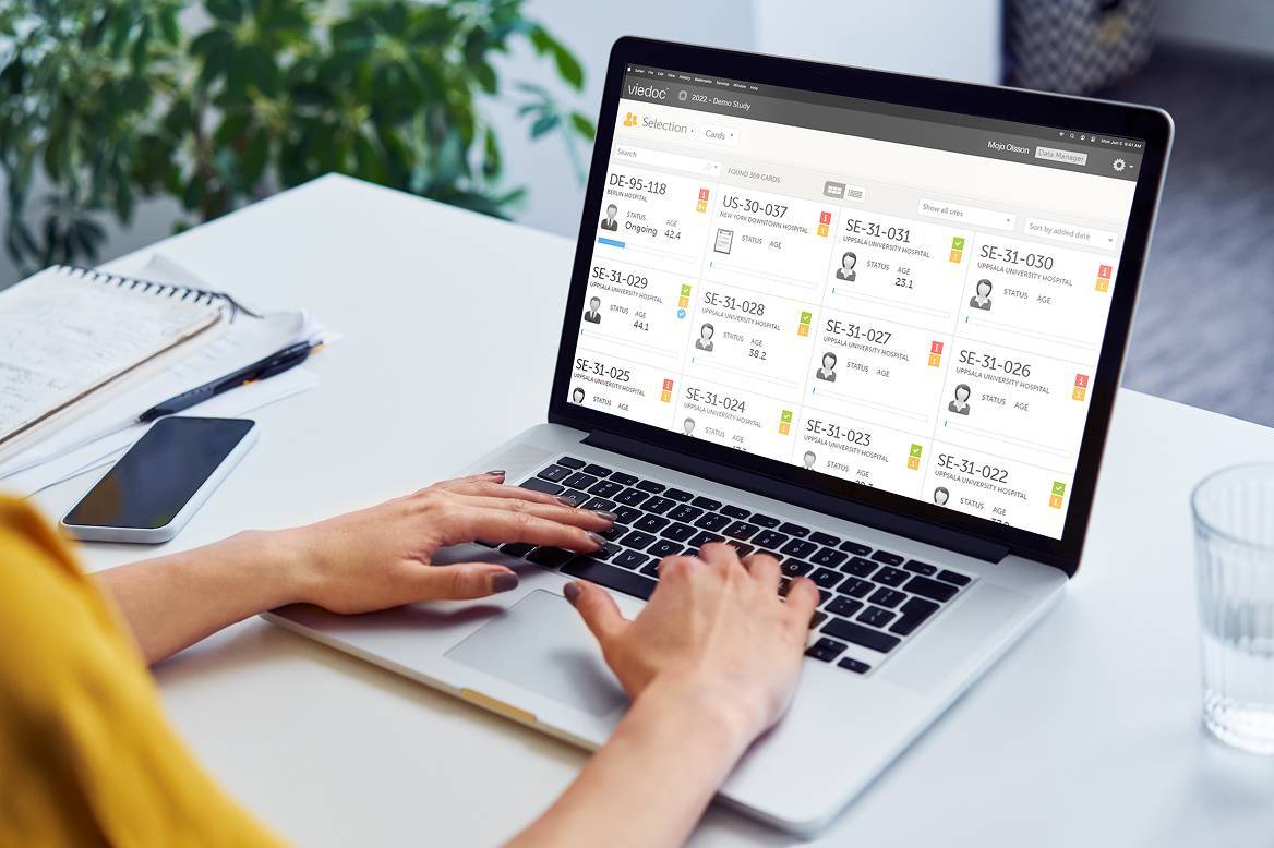
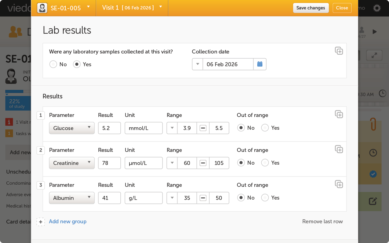
With the first iteration of our UI-optimization project released, our users will find that Viedoc is more modern and intuitive than ever before. Following our rebranding late last year, we at Viedoc are continuing to innovate our brand and the look and feel of our entire platform. Our last design update to our eClinical suite was back in 2012, and we feel it is time to give you a fresh update to Viedoc's interface. 

To start the project, Henrik Blombergsson, COO at Viedoc, along with the help of Antti Salmi, Creative Director, teamed up with a UI designer from Stockholm Design Lab (SDL) to define our new style. After defining the rebrand, the next logical step was a UI-optimization project, beginning with Viedoc Me, and extending later to all our add-ons and the Viedoc core. We sat down with Henrik to dive deeper into what this means for our users and what can be expected next. 

On Viedoc Me and the benefits of our first UI-optimized application

First, a refresher—what is Viedoc Me? Viedoc Me is an eCOA (electronic Clinical Outcomes Assessment) and ePRO (electronic Patient Reported Outcomes) solution in the form of a web application where patients enter their information with simple fill-in-the-blank questionnaires and submission. It works on mobile phones, tablets, and computers—whatever your patients have access to, or whichever they prefer. As long as they have access to the internet and a browser, they have Viedoc Me in their hands. Viedoc Me also allows patients to quickly connect with your team on-site via telemedicine calls using Viedoc Connect

When we asked Henrik why Viedoc Me was the first application to be updated, he had this to say:

- We had to start somewhere, and Viedoc Me felt like the natural starting point, especially as this application is widely used in our DCT (decentralized trials), where patients contribute to the majority of the data, and also need to interact with the sites. We basically felt we should give all patients the possibility to provide their data in an optimal, modern way. 

Introducing any kind of UI change can be sensitive as clients don't want to retrain their users, and certainly not the patients in the middle of a trial. It's even a regulatory requirement that any user needs to be trained on a platform before using it, which is why we introduce the new Viedoc Me UI as an option in the study settings. This gives clients full control over when to switch. Already started studies can continue using the existing Viedoc Me user interface, while new studies can adopt the new and improved Viedoc Me user interface. Patients will not be affected—a new study means new patients, and they will be trained in the Viedoc Me they will use. In this way, the introduction of the new Viedoc Me UI is painless and effortless. 

We introduced the new optimized user interface (UI) to Viedoc Me in mid-June. The improved interface benefits patients using Viedoc Me with clearer navigation and access, including improved compatibility with Viedoc Connect. As our rebranding project continues, the functionality throughout the entire platform will improve, too— but the changes aren't so dramatic that a Viedoc user will feel like a fish out of water. Henrik explains:

- As an example, we're moving away from some icons as buttons for different applications and replacing them with the word for the action, which will make navigation clearer and easier to understand. We have also been stricter when using various design elements throughout the different applications so that we don't introduce something new in one application and not in the others. This enhances the user experience in everything you do in Viedoc so that it will look and feel the same. There are too many examples out there of applications that look (and behave) completely different although they are provided by the same vendor, often as part of a “suite” of solutions.

Below, we run through the exact updates, what our new style looks like, and review what's changed regarding functionality.

On what was updated and what's changed from the old interface

  • The first aspect of the UI optimization you might notice is the overall look and feel of the improved UI, with higher contrast and changes to the font for a much more intuitive experience on our platform.
  • With Viedoc Me and Viedoc Connect closely connected, the redesign includes improved compatibility and functionality between the two applications. Users navigating the new interface can minimize and maximize the Viedoc Connect window during ongoing calls while navigating to other Viedoc Me pages. 
  • Additionally, subjects can fill in forms on Viedoc Me during a call with staff using Viedoc Connect. This update can simplify the process for decentralized and hybrid trials even further.
  • We introduced a new button notification to alert the user when an active video call is going on anywhere in the app. 

On what's to come and what to expect with our UI-optimization project

Henrik talked about what Viedoc users can expect moving forward:

- For the remaining applications, the switch to the UI-optimized interfaces will be pushed through gradually. We will start with the login pages and then one of the sub-applications, Viedoc Reports, which has been completely redesigned, but you'll see it when the update is released.

With applications such as Viedoc Reports, the next application slated for an update, the solution will be not to run both the old and new interfaces simultaneously. This means that once we switch over to the new interface, that will you be what you see when you open the application. We felt this was possible as this is an application that isn't exposed to site staff and doesn't require any input or data entry from the user. It's just a visual display of data already captured in the study. This gives us more flexibility to redesign it for an even better user experience. It's important to note that interested clients have the possibility to get access to our stage environment to try and explore this new interface before it's pushed out to production. And as always, you can count on the usual reliability and stability with Viedoc.

You can expect the UI optimization of Viedoc Reports and login pages sometime early to mid-fall this year. We're excited to bring you all the elegance and luxury of a truly up-to-date platform. The Viedoc team is always available to assist with any questions regarding our UI optimization. Get in touch with us to learn more about Viedoc's roadmap moving forward.

Viedoc is a leader in Electronic Data Capture (EDC) on G2
May 16, 2023

"Viedoc is an easy-to-use platform made even better with great customer service"